I'm a big fan of data visualisations. They're getting more and more sophisticated these days.
They're also entering the sports sphere increasingly — giving us another way to interpret the mass of statistics and data that we now have on offer.
This little blog named "dubly" has some nice looking infographics/visualisations on the NBA, including a look at how NBA dynasties have performed over the decades with respect to their leading scorers. I'm yet to work out exactly what these particular visualisations can truly tell us (since scoring is but one aspect to the game of basketball), but they're pretty to look at all the same.
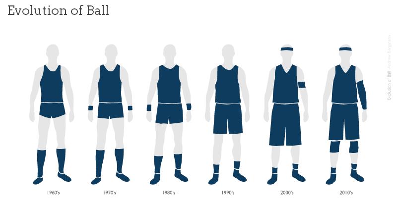
The author also has a cool visualisation of how basketball uniforms have changed over the decades. Go and take a look if you're into that type of stuff.